To put it simple…
An iPhone app is not a mobile strategy, it’s an iPhone app. Said by Google’s Ian Carrington, tweeted by @chrisjvernon Image source: www.flickr.com/photos/aftab/3602645078/in/photostream
An iPhone app is not a mobile strategy, it’s an iPhone app. Said by Google’s Ian Carrington, tweeted by @chrisjvernon Image source: www.flickr.com/photos/aftab/3602645078/in/photostream

Sometimes something leaks or goes live when it’s not meant to. No matter what precautions you take, when the human factor (or technology for that matter) is involved mistakes happen.
It [Zune] plays music just like an iPod! Why don’t people get this? I don’t know why people want this one chunk of plastic over the chunk of plastic that I make?! Bill Gates character in Charlie and the Apple Factory. Quote taken from the UX booth article UX is 90%
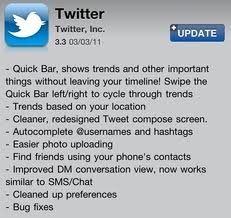
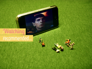
Last week Twitter released version 3.3 of their Twitter iPhone app. Some of the features are lovely and a great example of how to adapt your app according to the device. However, one new features was not great namely the quick bar which overlaps the tweet feed.
One of the things I go on about most is sustainable design, i.e. planning, designing and developing for longer term needs. It hurts my little IA heart when a project is done half-heartedly just to get “something” live.
[youtube id=”O94kYyzqvTc” width=”475″] Image source: www.flickr.com/photos/jdhancock/3383629917
[vimeo id=”19131028″ width=”475″ align=”…”] Image source: www.flickr.com/photos/jdhancock/3383629917
With my imminent departure from a permanent job I will no longer have a work laptop which I can take home and use. I didn’t use to have do this but the HP laptop we bought 2 years ago is broken (again) and Currys refuse to fix it because we
The heading quotes a tweet by Flo Heiss, one of our Executive Creative Directors here at Dare. Up until I saw that tweet I hadn’t actually looked at Quora yet. Well, I tried but arrived at their home page which said nothing, or correction, showed nothing of what Quora was
A couple of weeks ago I wrote a post about better IA where I listed a few things I’m a big advocate of and which I belive makes for better IA.
Facebook has yet again rolled out changes to their design and today was the first time I got the option to change to the new profile page.
Yesterday I received a confirmation email for my submission to the IA Summit in Denver next year. I’ve never presented at a conference but it’s been on my wish list for a while. This year they were looking for submissions from new speakers and the subject was “Better”. How we
At the end of January this year I broke our boiler. By turning on the timer. It was old and would have broken anyway but it came at a really bad time. It was cold in the UK and we had just moved into our flat and were starting making
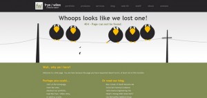
Error pages aren’t the most fun thing in the world. It’s not the pages that one normally looks forward to designing. They tend to be forgotten. A bit like the stuff that’s furthest to the back of your fridge, which starts to smell after a while.
This morning a colleague of mine asked me if I was going to that meeting about “that page” of “that client’s” website. The way he said it it sounded like he asked me: “Are you the [name of page]?”.
No matter what industry you are in your customers/users will go through a certain lifecycle with regards to your product or service, starting from being completely unaware of it, to e.g. considering buying/using it, to purchasing it and needing support after the purchase.
It’s easy to get pulled into the usual way of doing things. To take for granted that a presentation requires a formalised presentation, or that you have to sit in an office and work. Sometimes, stopping and questioning leads to more satisfactory outcomes.
To blog is a little dream of mine so I’ve decided to blog. About what I do for a living. I guess that means I feel I’ve got something worthwhile to say about the matter. Whether that’s true or not I’ll leave to you.