The heading quotes a tweet by Flo Heiss, one of our Executive Creative Directors here at Dare. Up until I saw that tweet I hadn’t actually looked at Quora yet. Well, I tried but arrived at their home page which said nothing, or correction, showed nothing of what Quora was about but just asked me to sign up. Couldn’t be bothered so I closed the page.
Then a few days later I saw Flo’s tweet and as my twitter stream last week had been filled with people referencing Quora and the answers/questions they’d posted there, it was time to find out what it was all about. And if Flo was right that it was an UI/IA mess. If you can’t be bothered reading the rest of this post I can reveal that I agree. Here is why:
The gap between the objective and the experience
The idea behind Quora is simple. You post a question. People answer. You can vote up/vote down answers and edit the question until you have an ever improving array of questions asked and answers posted. You can add questions to topics, follow topics, questions and people. So the idea is simple and builds on quite a few principles we recognise from Wikipedia, Facebook and Twitter. Should mean that the execution is simple as well right? Well, not in this case.
At first glance all I see in my newsfeed are updates from people I haven’t explicitly said I want to follow (more on this below). There is no clear signpost of where I need to go to find out what types of questions Quora holds or where I should go to search for questions. Where do I find a list of all the topics that are available? Not to mention all of the questions from people that I don’t follow?
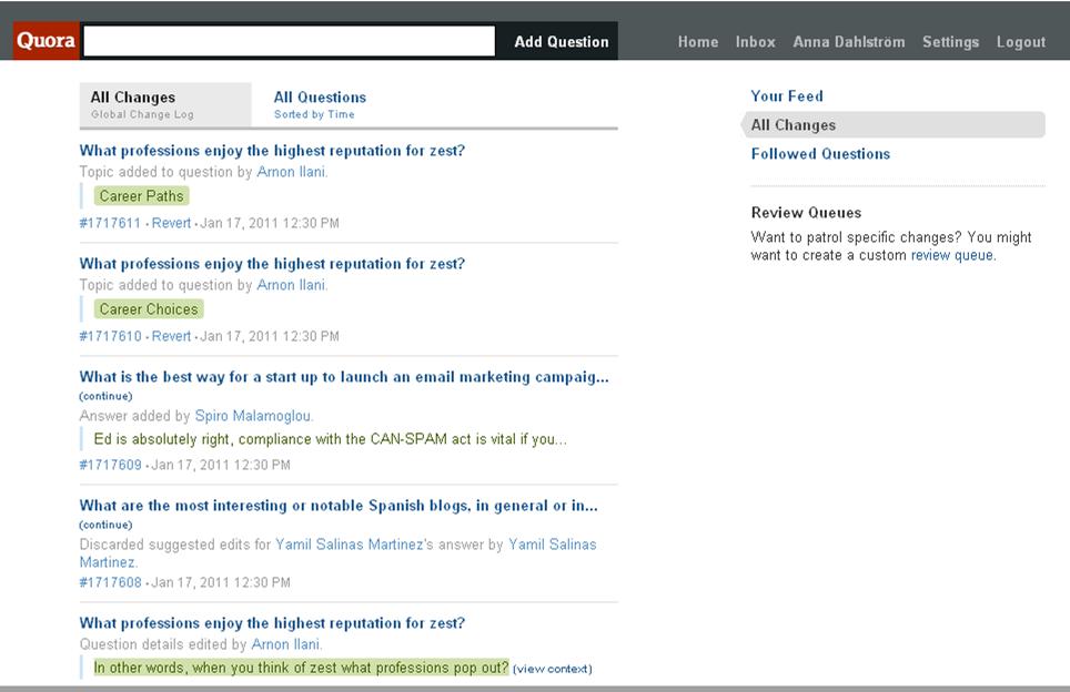
By clicking through the different menu items I end up in a some-kind-of version-of-what-I’m-looking-for. Only it’s labelled ‘All changes’. Little does that reveal that under this menu item I can also find ‘All questions’ (sorted by time):
Despite saying the following on their About page:
The most important thing is to have each question page become the best possible resource for someone who wants to know about the question.
…it is cleared that Quora haven’t really thought about how users will actually use Quora and find questions. They’ve focused on the feed assuming that feeds are what we want, failing to acknowledge that inherent in a feed is that unless you sit glued to it you miss a chunk of updates/new items, which in turn means that you need a tool to later filter through and find the items that you are interested in.
Quora is supposed to be a library of questions and answers. What library would only have books sorted by the date they were published, or last returned?
Solution: As for finding all questions and topics it would be a good idea to create a new menu item called ‘All questions’ and to allow the user to filter the list not only by time, but also by A-Z and by topic. Oh, and sorting out the search (next point) would be good too.
Misleading labelling & visual treatment of mutli functions input field
At the top of the page there is an input field which is seemingly labeled ‘Add question’. But I don’t want to add a question. I’m looking for a search field where I can search for question. But I can’t find one. Surely they must have a search field on Quora?!
It’s only when I put my mouse cursor in the text field to the right of the label ‘Add question’ that this instruction appear:

Predictive search fields are great when you know what you’re looking for but less so when you don’t know what you’re looking for and just want to browse. If I want to get an overview of what type of content, i.e. topics, that I can find on Quora, relying on me starting to type something in isn’t very helpful as it will only ever show me results that match the character(s) that I put in. Especially not when it isn’t even clear that’s what I’m supposed to do.
Solution: Include instructional text along the lines of ‘Search or add question’ in the input field and ensure action labels are positioned and visually treated so that it’s clear to the user what they relate to. Oh, and create that proper list of topics as per above.
Unclear differentiation between different types of content
Looking at my Quora feed there is a lot of text. Some in blue. Some in black. Some formatted bold. Some normal. Looking closer at the feed items some are on friends having started to follow a question/topic, some on that an answer has been voted up, some on that a question has been added to a topic. But it all looks more or less the same:
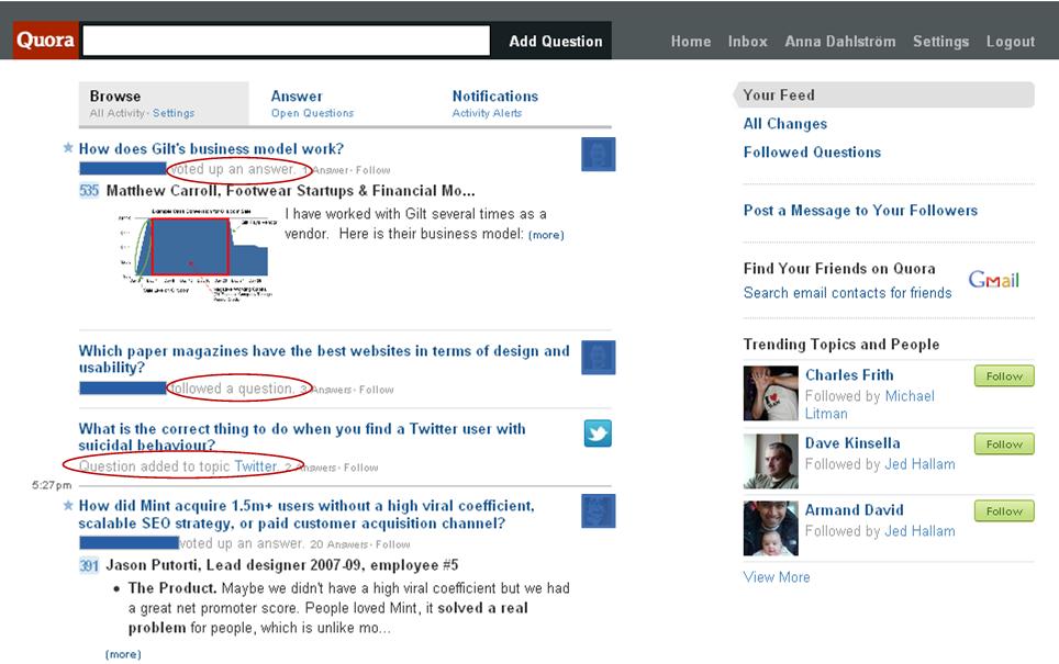
Solution: Take outset in the action that a user has carried out and develop different visual (including layout) treatments for:
[list type=”arrow”]
[/list]
This will allow the user to quickly skim the newsfeed and eaiser pick out the updates they are actually interested in.
Using the same visual treatment for two different things
In the Quora feed there are little thumbnails next to each item. They are positioned on the right hand side. Supposedly to be different from Facebook and Twitter who have them on the left hand side. In some cases they are used to represent which user that has carried out an action and in other instances they are used to represent the topic that e.g. a question has been added to. Very confusing:
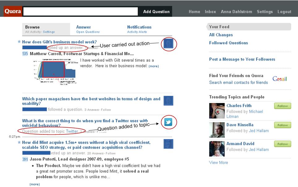
Solution: Differentiate the positioning and visual treatment between thubmnails representing a user and thubmnails representing a topic to allow the user to easily identify what items that are related to their friends doing something and which items that are related to an action being carried out on an object.
Unclear friends adding process
When signing up to Quora using either your Twitter or Facebook ID, Quora automatically adds all of the people you follow/are friends with (and who have a Quora account) to your friends list. The mistake Quora makes in this process is three fold:
- Treating signing up with Twitter and Facebook the same way
We use Facebook and Twitter for different things. Most of us (in our age group) are only friends with people we know or used to know on Facebook. In the beginning you added more people than you actually kept in contact with only to see what they were up to now. It was lovely to begin with. Until your Facebook newsfeed was getting spammed with updates that you actually weren’t that interested in. So we started to remove people from our Facebook friends list and hide newsfeed updates from certain people. All to ensure that we get to see the updates that we are actually interested in.
Twitter on the other hand is a different matter. We follow people we’ve never met and it’s all done on a trial basis. If they prove to be uninteresting or annoying in their tweets we unfollow them. Simple as that. We use lists to organise some of the people we follow in order to quickly being able to catch up on a number of tweets from people that we’ve missed but are interested in.
By automatically adding everyone Quora is ignoring this difference and not taking any consideration to the sorting of people we follow/are friends with that we’ve already done. I.e. they are automatically adding a bunch of people we’ve already filtered out. - There is no option during the ‘find friends’ process to de-select people
It’s great that Quora allows you to easily add friends. Only they don’t show a visual representation or list of who these people are, or provide you with a means of de-selecting people during the ‘Find friends’ process:
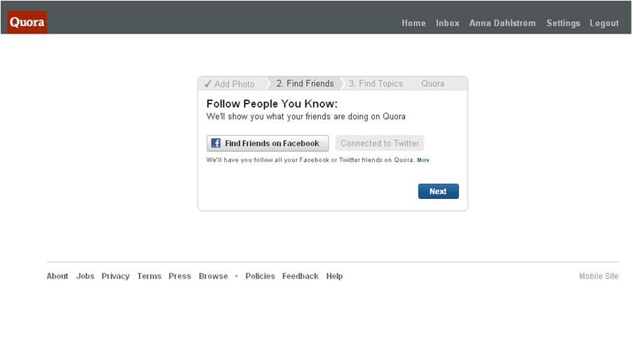 This is bad. Very bad. It means that one of the first things I need to do when starting to use Quora is find the setting where I can see who I’m apparently following and start going through the list and unfollow people. One by one. Dear, oh dear. Haven’t these people learnt anything from Facebook’s “share/invite your friends” functionality?
 - Asking us to trust Quora rather than showing that we can trust Quora
When clicking the ‘more’ link under the ‘Find friends’ list I’m hoping to get some instructions on where to go to unfollow people. But instead I get this message:
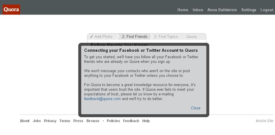
That is not how it works Quora. You earn users trust by doing and reassuring them that you are trustworthy. Not by asking. At the point when you’re asking for my trust you haven’t even given me a taste of what I’ll get when I’m signed up and you’ve automatically added everyone without me asking you to. Not cool.
Solution: Allowing the user to add friends from their current networks are great but, as a fundamental principle, also include an option in the same step which allows the user to de-select friends. And make it clear what you’re doing so they don’t get a heart attack thinking that you’ve now sent a message/automatic update to all of their friends. Finally, be clear up front of what is will happen and provide the user with an option to say no to the offer of adding all of their friends.
Forcing users to create an account before getting involved
Users get involved in different ways. Some are passive observers. Some active contributors. There is no reason why Quora can’t or shouldn’t feature trending topics or questions on their home page, or allow users to browse through a list of the same without being logged in. Quora is about knowledge sharing. Knowledge should be free and open. Not locked behind a ‘create an account’ door like this:
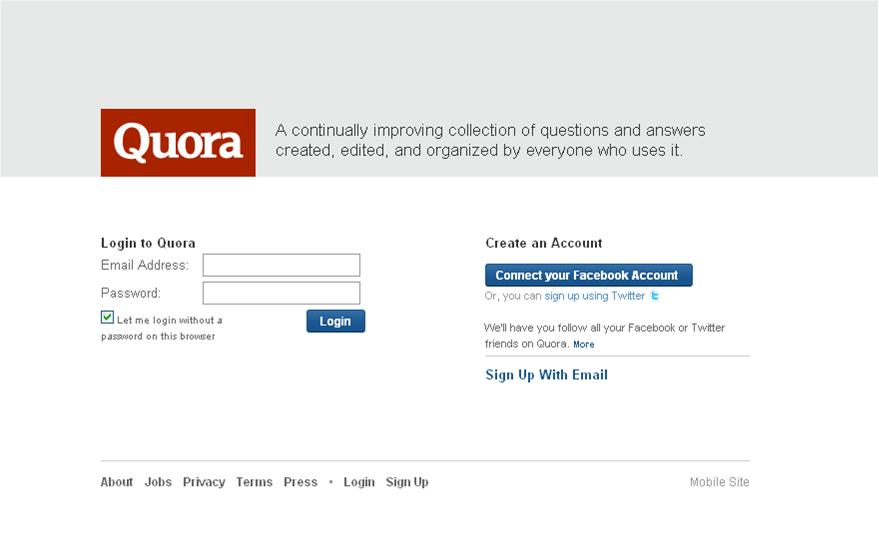 Solution: The home page should be the window into the site and give a a snap shot of what is currently being talked about by featuring trending topics and people. Using progressive signup Quora should only ask users to create an account or login when they opt to carry out an action which requires knowing who the user is. Until then users who don’t wish to create a Quora account should still be able to browse through a generic list of questions and answers and filter it to find what they want.
Conclusions
There are many elements of Quora that screams Facebook and Twitter. Looking at the people behind Quora they come from…. Yep, you’ve guessed it. Facebook mainly, but also Twitter. Not surprising then that I recognise some of the flaws with Facebook and Twitter on Quora. Or, that they’ve tried, really hard, to make the Quora layout different despite the principles behind the feed being the same. Sorry to say, but in doing so you’ve also broken some things which actually work and as a result ended up with a UI/IA mess. It’s not to say that it’s unsuable. You learn your way around it quite quickly, but that doesn’t mean that it’s good. No, I expected more from Quora. It’s an intriguing idea and one that has some potential to be great.
Perhaps we’re in for as many IA and design changes with Quora as we’ve seen on Facebook?
Image source: www.flickr.com/photos/jluster/8385042152

