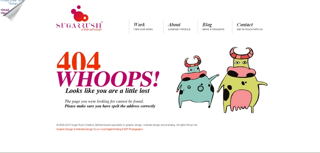
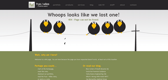
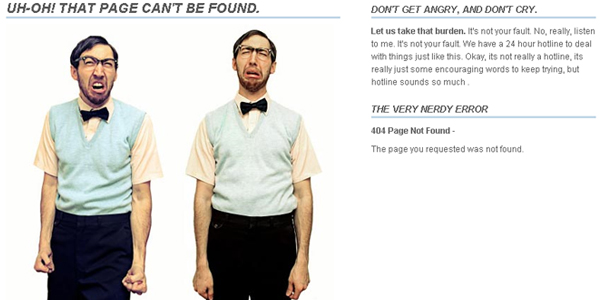
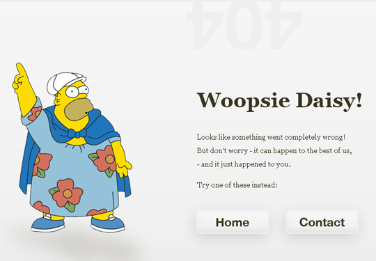
Error pages aren’t the most fun thing in the world. It’s not the pages that one normally looks forward to designing. They tend to be forgotten. A bit like the stuff that’s furthest to the back of your fridge, which starts to smell after a while.
They are a little like that thing you’ve done which you hope noone will notice. A bit embarrasing. They aren’t meant for the world to see as it means somethings gone wrong. But, they are nothing to be embarrassed of. If you’ve done them properly that is. They offer a great opportunity to be creative and to show your users that you’ve considered every eventually of your website and that even in times of trouble you have something to offer them.
Three good principles for your error pages
- Treat them as any other page of your site and do IA and design for them so they become part of the experience
- Provide an explanation to why the user is seeing the error page, or if the problem is unknown be honest and say that you don’t know what went wrong
- Give the user a pointer to where to go or what to do next by including links to related pages (of what the user tried to access), key pages of the site, and/or a search field


