The other day I stood in the self-check out queue in Tesco watching the woman in front of me struggle to pay for her 6 pack of Pepsi.
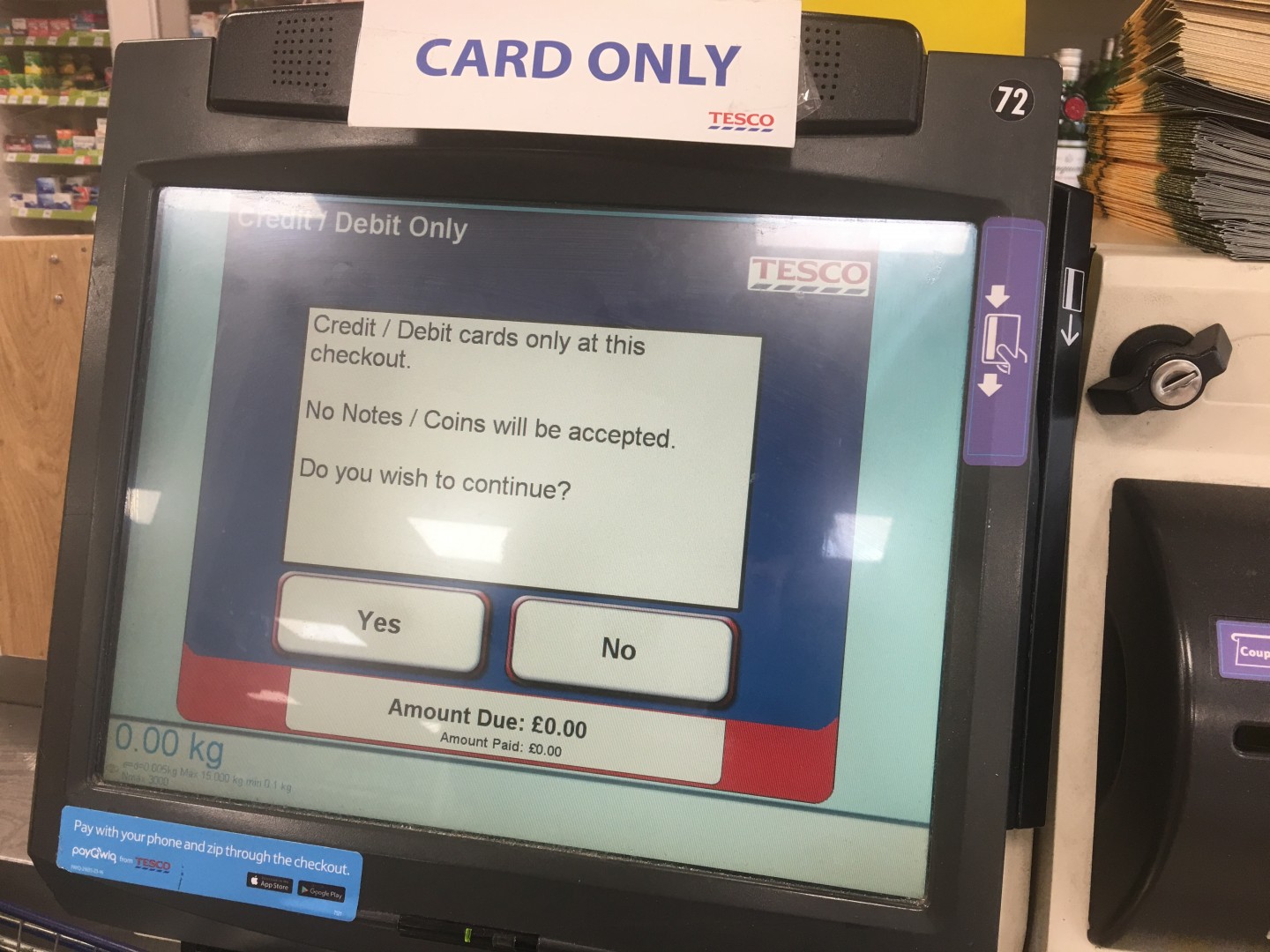
For months the self-checkouts in our local Tesco have been card payment only. There’s a fairly big sign at the top of each machine and the first thing you see is one of two buttons that also informs you of this matter. Once you’ve tapped ‘Start cards only’, or scanned your first item, another screen comes up informing you that it’s card only and asking if you wish to continue. You have to answer ‘yes’ or ‘no’ to get past the screen. Though I didn’t see her interact with this screen, there’d been no exception for the woman in front of me. Unless she’d just started scanning her Pepsi, she’d been shown it and she got passed it by tapping ‘yes’.
Where I saw her get stuck the first time was the screen that asked her how many carrier bags she’d used. The answer was none so she didn’t put in a number on the screen but instead kept trying to press ‘Enter’ to move ahead to the payment screen.
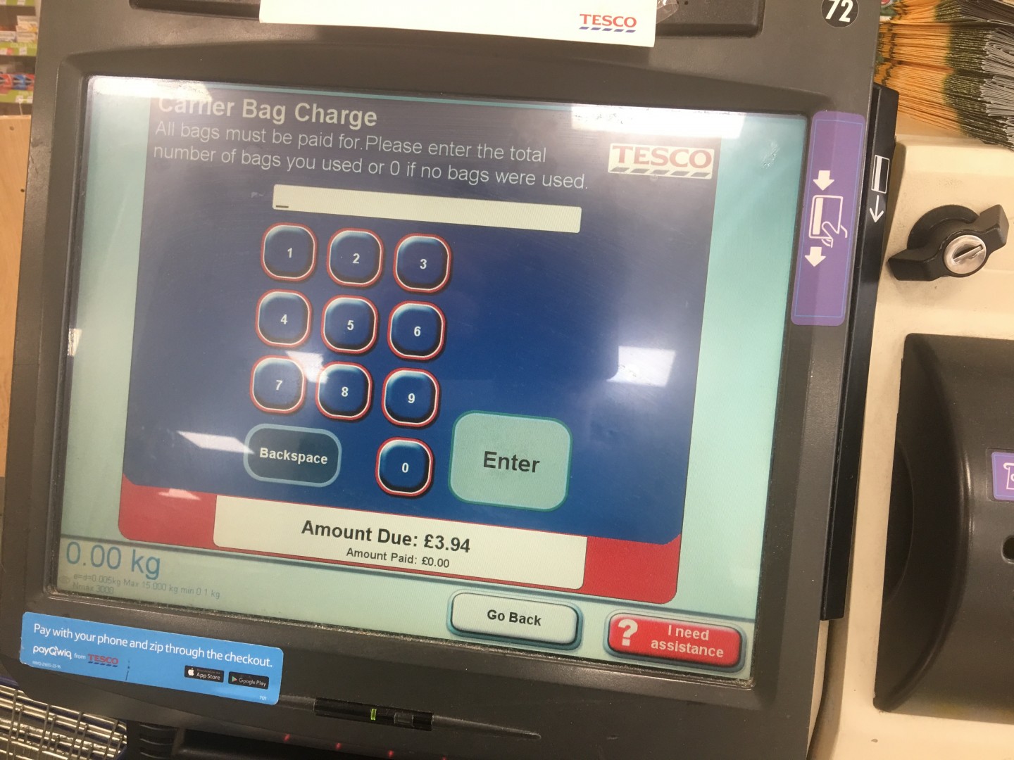
However, the self-checkout machine needed her to put in a number. She didn’t and went back and forth between ‘Go back’ and trying to get past the carrier bag screen by tapping ‘enter’ again and again. After a few attempts and the woman looking around for a Tesco staff to help her, I walked up and pressed the ‘0’ and she could move on to the payment screen. However, she had a five pound note in her hand and wanted to pay with cash, but there was no cash option.
The bigish ‘card only’ sign was at the top of the machine the whole time. Yet, she was trying to look for an option on the screen to pay with cash and when she couldn’t find one, she called a Tesco staff member over who informed her that it was card only and that she had to go to the tills.
It’s easy to think that it was the woman’s own fault, “how could she miss it?!” etc. but in the end that doesn’t matter. For whatever reason, she did miss the bigish sign on top of the self-checkout machine and clearly didn’t pay attention/ ignored the screens where she was informed about card only and asked if she wanted to continue. Though I haven’t done any scientific research on the matter, I’ve seen plenty of people in our local Tesco go through the same and attempt to pay with cash when the machine supposedly clearly tells them that it’s card payments only.
As designers we often think that the UIs that we define and design are obvious. Some designers hide away navigation in favour of the hamburger menu to make the designs cleaner with the argument that “users know”. Information and CTAs are mixed with other information and CTAs on a page and to us it’s obvious where things are and that the hamburger menu will give you the actual menu if you click/tap it.
If you observe users actually using and (trying to) interact with what we’ve designed it becomes obvious that the obvious is not so obvious. The majority of users don’t know that the hamburger menu is indeed a navigational menu and they definitely don’t see the UIs that we’ve designed in the same light as we do.
We’ve spent time meticulously working through the content and the layouts of the same. We know where everything is and why it’s there. Users however, are often in a rush. They glance over a page, their eyes barely resting on but a few elements, often resulting in a click or a tap on what seems to meet their expectation the most combined with what’s standing out to them as a CTA.
As for the woman in Tesco and others like her, I suspect, though I’d have to ask a number of people to confirm it, that when they are presented with the ‘card only’ screen, all they see and pay attention to is the ‘yes’. That’s all they are after. A yes to continue with their shopping and to, as quickly as possible, get to the payment screen so they can get out of the store and home to enjoy/ cook what ever they’ve bought.
As for how to solve the problem and find the best solution for users not noticing the ’card only’ at the Tesco self-checkout machines, there are a number of things that could be tried. Though to inform which ones to develop and test, it’d be wise to observe and chat to users first to get some qualitative insight into why they’re not picking up that it’s card payment only.
Taking our time to do this type of research and testing will not only help save companies money, it’ll remove frustration amongst the direct user who struggles but also any “queuing” user who might end up getting annoyed with the yet another person that’s chosen the wrong payment queue.
In the end, all of our experiences matter and impact our lives in one way or another, and just like the butterfly effect, one person’s bad experience, direct or indirect, can set off a series of less fortunate events and cause more negative experiences, all derived from a bad mood caused by a bad experience. As designers it’s our responsibility to minimise as many of these bad experiences as possible. Making assumptions or brushing off the need to test what we’ve designed as “it’s obvious” just doesn’t cut it. We need to test it and see how actual users interact with what we design.