The first episode of this season’s Horizon, a BBC science documentary, was titled ‘Do you see what I see’. It was about the science of colour, how we perceive and are affected by them.
The programme explored amongst other things if there is any truth behind the winning effect of the colour red, if a colour can speed up time, and if age, gender or the language we speak affect the colours we see. With the help of a number of scientists the team conducted a set of experiments and the results were a big surprise.
They started out by testing the colour red that has a lot of myth associated with it. Particularly in sport where it’s associated with having a winning effect. Findings from a shoot out test showed that wearing a red coloured shirt lowered the test person’s cortisol levels, leaving them less stressed and more confident, but playing against an opponent who was wearing red showed no effect on the opponent. In Taekwondo however, where the contestants are randomly assigned the colour red or blue based on their ranking, research conducted by Durham universtity showed that there were substantially more red winners than blue. In fact, in the 2004 Olympics red wearers won nearly 2/3rds of the battles. After further looking into the reasons behind the results the researchers found another study that showed that the colour the contestants were wearing actually manipulated the taekwondo judges scoring verdict.
The study had been carried out by taking footage from a battle where the red wearer had won and where the colours in the footage had been digitally reversed so the red wearer was now wearing blue and vice versa. Interstingly, the test showed that the taekwondo judges tended to rule in the red wearers favour not only awarding them more points but contradicting the actual real life battle scores.
Other tests conducted by the Horizon team showed that when participants were placed in coloured light pods (red, blue and white) and asked to signal when one minute was gone, blue had the effect of speeding up time and when used in a restaurant as lightning, blue make us feel more awake.
The team conducted a number of other experiments which concluded that the answer to the question “Do you see what I see?”, is that it depends on what we’re looking at. If the object we’re looking at is based on evolution then yes, we probably see its colours somewhat the same way, but if it’s an object that is shaped by our own personal experiences then the answer is “probably not”.
(See the full episode and learn more about the other experiments conducted on iPlayer)
The powerful effect of colours
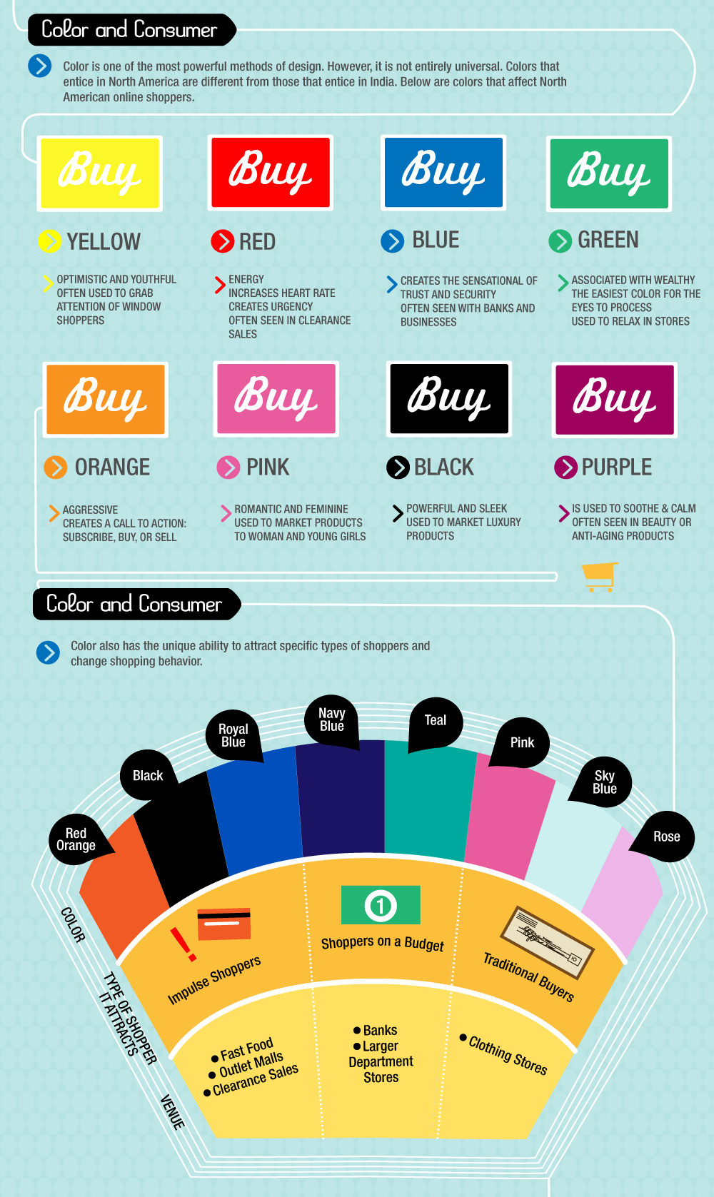
According to the Horizon team colours have an even more powerful way to affect us than what has previously been known and the more we learn, the more it’s destined to change the way we use colours and the way we see colours being used. Our age, sex, mood and even the language we speak all effect how we perceive colours. This part of an infographic from Daily Infographic, show colours affecting North American online shoppers but, as the infographic states, it wouldn’t be the same if it was done for e.g. India:

(See the full infographic on the Daily Infographic site)
Though we can’t let the effects colours have on us rule and override branding, there are definitely some useful insights to learn from in terms of what message use of colours send to users in different countries, of different genders and varying age and so that background color, or the the colour of the call to action are not to be taken too lightly.


